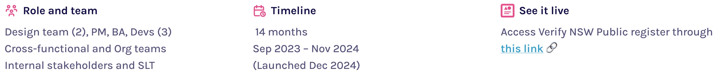
This project focused on modernising the NSW Public Register platform, Verify NSW through data-driven UX/UI improvements and a service design audit. I led the initiative to identify pain points, analyze SEO performance, conduct service design audit and develop personas, resulting in a redesigned interface that better supports user workflows and improves the platform’s online presence.
Verify NSW is a centralised platform that offers transparency and accessibility to licence and registration information for individuals, organisations, and government regulators. The platform consolidates data from over 20+ different registers, enabling users to verify licences, check compliance, and access public records. As the digital hub for various schemes, it serves a critical role in fostering trust, ensuring accountability, and simplifying regulatory processes.
However, as user needs evolved and feedback poured in, it became clear that the platform required significant improvements. The redesign project aimed to address usability gaps, enhance data accessibility, and streamline the user experience for all stakeholders, ensuring the platform remains a trusted and efficient resource.


Despite its essential role in providing transparency and access to public information, Veirfy NSW platform faced several usability and experience-related challenges that hindered its effectiveness:


No project is ever a straight line, and our work on the Public Register platform was no exception. Through the Sludge Audit, facilitated by the Behavioural Insights Unit, we uncovered unexpected insights that shaped our redesign strategy in profound ways.

These insights added a layer of complexity to our challenge: it wasn’t just about improving functionality but also about educating users, increasing awareness, and building trust in Verify as a service
The redesigned Public Register platform addresses critical user pain points identified during research and testing, paving the way for significant improvements in usability and efficiency.
While the redesign has just gone live, measurable outcomes were predicted through robust testing and user validation:

For this redesign, we worked in two phases, phase 1 includes:
Revamp of the home page to make navigation intuitive.
Improved search journey with a prominent search bar accessible from multiple points.
Redesigned results page and details page to simplify consumption of information.
Updated layouts for clear, easy-to-read timelines and more visible compliance information.
Enhanced functionality to save, share, and print records.
Improved breadcrumb navigation for consistency.
Simplified feedback submission, making it easier for users to share thoughts.
Improved website visibility through SEO optimisation.
Enhanced navigation with a global menu and “jump to section” feature.
Introduction of an "About Us" page, along with Help and Glossary pages.
Restructuring of content to reduce redundancy and improve the information hierarchy.
Redesigned section headers with a universal nomenclature across all registers.
The transformation of the public register platform required a meticulous and user-centered approach. By combining deep research, collaborative problem-solving, and iterative design, we addressed user pain points and laid the foundation for a future-ready solution. Here's how we brought the redesign to life:
I began with a comprehensive audit of the existing platform to map out inconsistencies, usability gaps, and outdated elements. This audit formed the blueprint for a redesign that would align with user expectations and modern standards.

I analysed historical user feedback and customer support data to identify key frustrations. Recurring issues like difficulty navigating the platform, understanding licensing terminology, inaccurte/confusing information and ineffective search functions became our focal points.

To ensure the redesign addressed the diverse needs of all user groups, we created detailed personas for the General Public, Licence Holders, and Regulatory Stakeholders. These personas helped guide our design decisions and prioritize features based on real user needs.

Benchmarking against leading public registers and government platforms helped us adopt industry best practices. This allowed us to incorporate innovative solutions such as streamlined navigation, enhanced search functionality, and better information hierarchy.

Search engine discoverability was a critical pain point. Using tools like Google Search Console and Keyword Planner, we identified high-value keywords to improve the platform's ranking. Our efforts aimed to ensure users could find Verify easily, no matter how they searched.
Collaborating with the data analytics team, we assessed user behaviour through various data sources. These insights highlighted where users engaged the most, how they interacted with features, and what content resonated most. For further details, refer to my project, Revolutionising Analytics. Its protected project —feel free to reach out to request access.

I led a six-week service design audit in collaboration with the Behavioural Insights Unit. This in-depth review, facilitated by Sludge Academy, revealed bottlenecks in user behaviour, such as misunderstandings around platform usage and an over reliance on external search engines for finding licenses.

User testing was an integral part of the design process, allowing us to validate the redesign with real users and ensure it met their needs. The testing sessions were conducted with diverse user groups to gather insights on navigation, task completion, and feature comprehension. Here's what we learned:

We created high-fidelity prototypes in Figma to showcase proposed enhancements, including new navigation structures, a simplified information layout, and prominent search features. These prototypes allowed us to gather user feedback and refine the designs iteratively.

Building the platform was a collaborative effort that required continuous iteration and close collaboration between design, development, and QA teams.


The journey doesn’t end with the redesign. Future plans include:
🚧 Phase 2 Enhancements: Focus on improving website visibility, refining navigation with a global menu, restructuring content hierarchy, and expanding user resources to further elevate the platform's usability and reach.
🔄 Iterative Testing: Conducting regular usability tests to fine-tune the platform post-launch.
📢 Continuous Feedback: Expanding user feedback channels to ensure ongoing improvements based on real-world usage.

The redesigned Public Register platform is a testament to the power of user-first design.
By addressing pain points and creating a foundation for scalability, we’ve set the stage for a platform that’s intuitive, accessible, and impactful for all its users.
Next Project >


